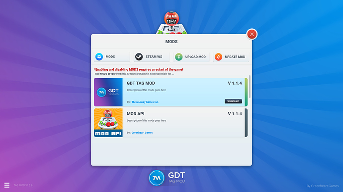
well this particular one looses the left click menu after you develop one game, so it’s game braking…
Ah yeah that I wouldn’t want to try xD
Is that the only major bug right now?
that I know of at the moment. We have to do a code check to see whats what.
If there’s anything I can help with with the development just tell me, I could try doing CSS, but I don’t know if I can do that part.
and there I was thinking you would just use our topic images from the mobile version once the port goes live 
This looks amazing! Outstanding work 
When will the steam update actually come out lol, then the topic images here won’t be needed anymore right? Or does steam not get the new UI?
It gets some of the new UI, yes. I’ve implemented the new topic picker (including icons) and also went and ported the new message system so you can pick which messages appear through the sidebar and which auto-open. Otherwise the UI stays much the same but those two features make quite a difference.
I also loved the reviews screen for iOS, have seen some screens, will that get to PC too?
not planned yet but I am meaning to take another look at this.
Alright, thanks.
Oh my freaking god I want that so badly, it looks SO AMAZING.
i want test it so much!!!
So much has changed, this looks gorgeous.
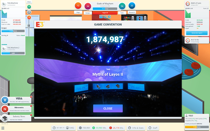
Here’s an idea. Could you make multiple of these conventions except its a bit more Historical Accurate?; relating to the years the player is holding a G3.
That way, players won’t have to see the same image for a moment until the end of the in-game year arrives.
Waaaait… MULTIPLE FLOORS?
The original plan was after the UI upgrade to implement some new game play features, but that’s a big maybe in the future.
Well multiple floors could mean multiple development teams, working on multiple games at once would be a great addition, I would LOVE to use that,

