Been doing some alternative ways, found a bug that has to do with Text Overlaps.
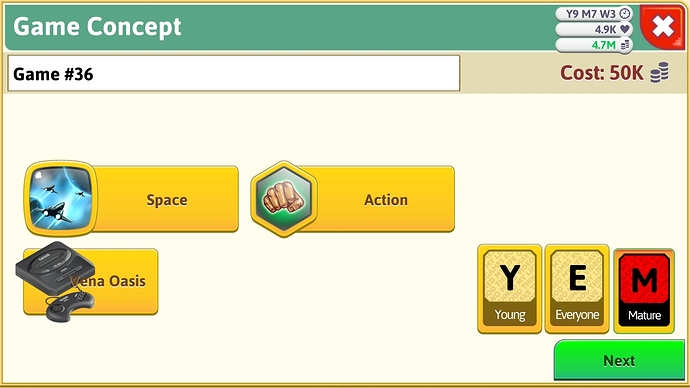
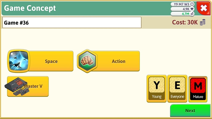
Examples of Text Overlaps:
These texts, the platform section, should be moved a little to the right.
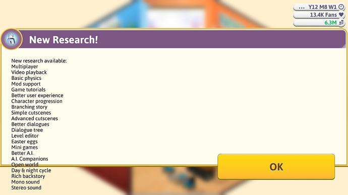
This is what happens if you don’t research Custom Engine after you already gained 50 Research Points from Day 1.
Also, I do not have the screenshot yet. But there was like a text saying something like MVsomething-5
As an expense on the bottom right.
When I mean the something, I mean I have forgotten the rest that was called.


