I’ve been playing Game Dev Tycoon, and I love it. A really quick suggestion though is to make the orange part of your icon blank, because it looks much better when it’s not a square (especially on Mac, not sure about other platforms.
I agree with this, it looks very ugly, and the joystick will stand out just fine if you remove the orange and give it a Stroke outline.
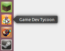
It also looks bad an the Unity-Desktop of Ubuntu as you can see here.
Look at the logo of Minecraft or Rochard, this two are fully adapted.
But hey, it doesn’t matter. Steam has the same problem as you can see.
Thanks for the suggestion, its not a bad idea! I will add it to my list of things to do 
2 Likes