Suggestions.
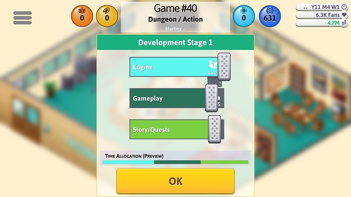
Could you move the bar a little bit higher? Those Sliders, the vertical rectangle one, is blocking the +++? view.
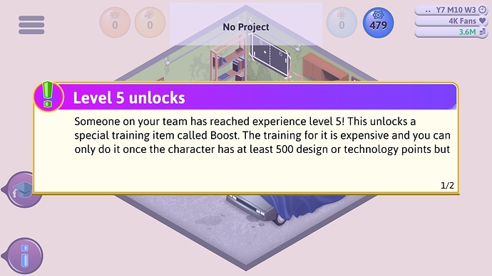
"Someone on your team has reached experience level 5!"
"This unlocks special training item called Boost"
"Only do it once the character has at least 500 design or technology points"
The text appears at the wrong office, I understand It only appears when “someone” reaches Lv.5, but could you guys add a different text?
For example, when the player did not reach Office 1:
"You have reached level 5, this unlocks a special training item called Boost. Although, you would need to reach your first office in order to acquire the ability."
Noticed I did not include the “500 design or technology points” text? This is simply because it’ll make some players be confused on How to. Meaning they’ll be asking these ridiculously simple questions that can easily be founded if they kept playing.
Here’s another text,
When you reach Lv.5, already in an office, but no staffs:
"You have reached level 5, this unlocks a special training item called Boost. Only do it once your character has at least 500 design or technology points. In addition, this can also apply to your staffs, that is… if anyone is working at your office."
Put a little lame pun in the end.
Last one text suggestion:
Reached Lv.5, But did not train yourself Staff Management
"You have reached level 5, this unlocks a special training item called Boost. Only do it once your character has at least 500 design or technology points. In addition, It can also apply to your staffs… Seriously? why haven’t you already trained yourself Staff Management?"
Another Lame Pun I added.
Again, the text does not have to be exactly. In fact, you guys can change the text to your taste. After all, it’s a suggestion.
One more, Could you also add an option in the Advanced Options section:
- Progress Offices Level Until…
*Don’t progress me at any office’s
*Office 1
*Office 2
*Office 3
*Hardware Lab
*R&D Lab
*HW + R&D Lab

