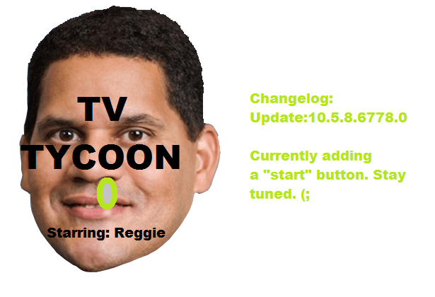
I don’t mean to be rude or discourage you or anything like that but by the looks of the cover ‘art’, this ‘game’ is doomed to fail if it will be programmed like that cover was designed.
Hopefully it won’t suck and I’ll eat my words. 
I don’t mean to be rude or discourage you or anything like that but by the looks of the cover ‘art’, this ‘game’ is doomed to fail if it will be programmed like that cover was designed.
Hopefully it won’t suck and I’ll eat my words. 
I hope soon you can hire a graphic designer, at least one with a couple weeks of knowledge.
You can use the cover I made a while back.
https://forum.greenheartgames.com/uploads/default/_optimized/cf0/3c1/4a91d77c04_690x388.png
Sorry dude, it’s worse then the last one.
That’s worse then the current one?
What does everyone think?
The one from @tntey tntey is a bit cooler, but there is only a “start” button. But if it would have some more colors and buttons to it… The outcome is really cool 
And for @awesomejuan36912 and @tntey, i only say this one is a bit cooler. I’m not choosing for any side here 
They all look like ms paint, no offense
[UPDATE] I have joined the development of TV Tycoon as Artist. Stay tuned for more updates.
hi,
i’m a developer and Webmaster.
I love your project <3 and i would like to become a member and help you with your game
Is it possibile?
Thanks 
Send me a pm.
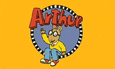
This reminds me of Arthur

How?
YESSS!!! Seriously tough, the one from @ShadowedDeath is better than mine.
This is mine:

I hope i didn’t scare you 
It’s not 10/10 but at least it looks like something
yay, progress!
Id love reggie as the main screen
Well, good job, that’s a little better.
Old graphix I guess.
I can do the musical aspect of it.
Which genre would you like?
only $200 each